
News & Updates
Mobile Device Design Optimizations
June 17, 2019
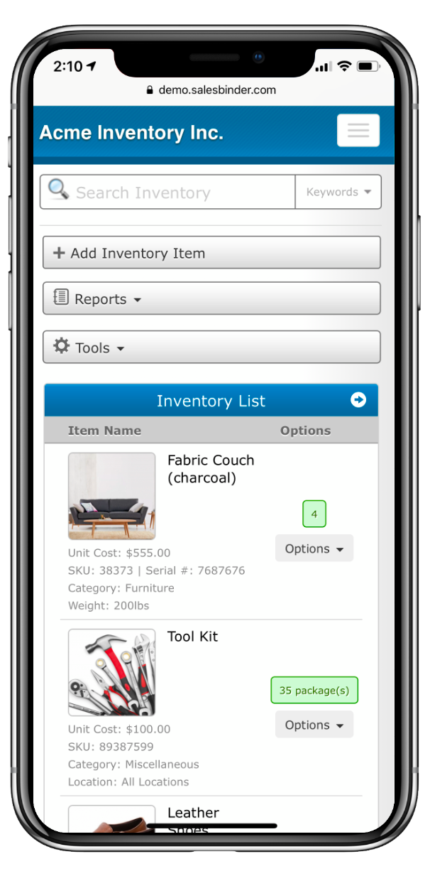
We’re really proud to share our completely redesigned layout for SalesBinder on smaller screens. You’ll notice SalesBinder now looks amazing on any sized screen. From the smallest sized mobile phone to the largest desktop sized monitors, you can now manage your inventory, sales, purchases, and everything else with the most intuitive design possible.
New Mobile UX Design
We released this update on the majority of mobile views throughout the SalesBinder web-app with a few more updates scheduled over the next couple of weeks. You’ll notice a vastly improved experience completely optimized and tailored towards the specific device you’re using to access your account.
If your screen is large enough, we’ll automatically utilize that screen real estate with a beautifully spaced out 3 column layout. If you’re in the middle of the road for screen sizes (small monitors, large tablets, etc) you’ll see a 2 column layout. Going smaller from there and accessing your account from any mobile phone you’ll see a nicely designed 1 column layout with custom design elements to enhance the overall viewing pleasure on small screens as much as possible.
We hope you enjoy these beautiful new improvements as much as we do!
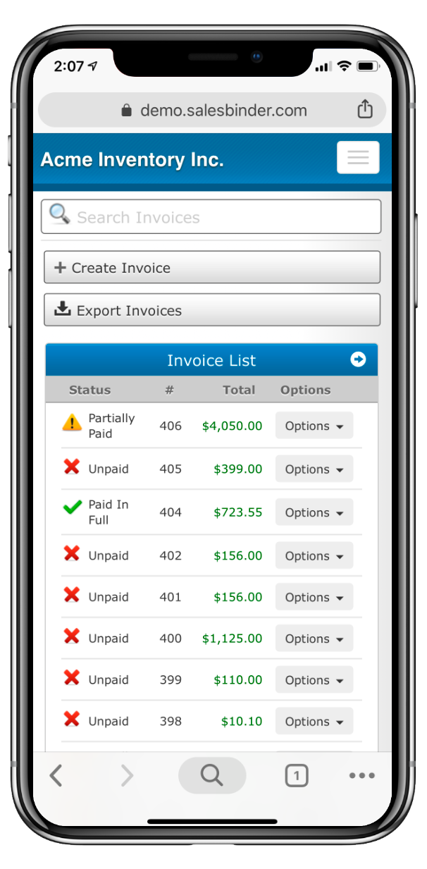
Sample screenshots from mobile Safari and Chrome
